THE OLD
Coding and WordPress
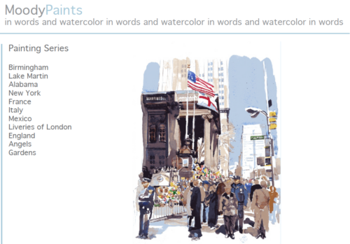 It’s always a huge undertaking to create a new website, so I thought it might be helpful to other artists to describe our process. Note that I had designed Bob’s first website in 2009 using WordPress.org. It was a cumbersome process that involved CSS and coding, and editing tools for images were limited. We created our logo using a standard font only and did not create a brand or mark, and we have since changed our tag line from ‘in words and watercolor’ to ‘pursuing a passion’.
Online Security and Size of Images
Over time, updating plug-ins and online security on his old site became a problem and Bob was never happy with the way his paintings appeared on the screen. We were initially concerned about the use of his images and made them intentionally small so that they could not be reproduced with any kind of quality. Of course, that also made them difficult to see. We have since discovered that any digitally published images are automatically protected. (Use of Images)
Organization and Tagging
We also had a problem with organization. Bob is extremely prolific and paints every day! Organizing these paintings into categories, making digital files, and tagging and naming them is the first step toward an organized website. If you do nothing else, name and tag all your digital files so that you can find them!
Clicking vrs. Scrolling
It was common to click to different pages back then. But too many clicks discouraged visitors from viewing images. That was a problem with our old website as scrolling was not a popular/available option at the time. This kind of formatting made the site look dated. We wanted a more modern looking site.
Software and Tools
We considered using WordPress.com which is the ‘free’ version but is limited in design options. The advantage is that online security is built-in, but you will pay extra to eliminate advertisements, and to use a custom domain name (rather than one that ends in wordpress.com). However, this is a good choice for websites that are heavy in information and don’t require as much flexibility (like this one that I manage: birminghamhistoricalsociety.com).
Finally, because Adobe Photoshop tools are now subscription based and very expensive for single use, we no longer had access to them. We knew we wanted to work with a professional to use the latest bells & whistles.
THE NEW
DIY vrs. a Professional
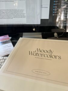
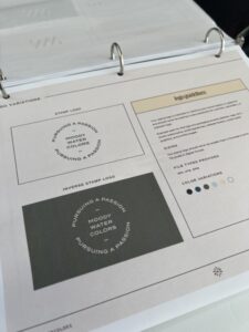
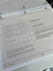
I’ve spent many years self-training and developing websites both for Bob and others, and I can tell you, it was wonderful to work with a professional. I’m not sure I would have ever gotten started on Bob’s site otherwise. We hired Kelsea Buddo of Cember Studio and were on her waiting list for over a year. In preparation, she gave us a questionnaire which required us to establish priorities, gather all our files that we wanted on the website, write text, consider a new tagline, get together passwords for our domain, social media sites, etc. and pull together examples of fonts and websites that we liked and why. We already knew that we liked what she had done in the past, so we were confident that we would agree on the design. But we also needed a mark to emboss prints, and wanted consistent branding across all our media. At the end of the process, she gave us an organized online dropbox folder with all the files, as well as a hard copy ‘brand style guide’ to show us how to use the brands, fonts, and colors across all platforms. I have NEVER felt so organized!
The Software
Kelsea specializes in branding for creatives, and as a result, she works exclusively with a software that showcases visual artists called Showit. It is a drag & drop platform with blogging built on WordPress. Existing WordPress blog posts are migrated and reformatted by the Showit team for free. It integrates with Shopify and WooCommerce if you have ecommerce on your site. We also used the free resources on Ashlyn Writes to help develop copy after watching her webinar on Showit’s site.
Showit makes it so stinking easy
to build a stunning website
that attracts the right clients
and helps you stand out.
Advantages vrs Disadvantages
- Certainly the design of the site is so much better than what we had and we’re so excited about that. The ease in changing things is an advantage although we don’t plan to do much changing.
- It’s slightly more expensive than a free platform. We have a basic plan at $228/year. A free WordPress.com site with the upgraded advertising removed and a custom domain name is $96/year.
- The blog formatting is incorporated into the design which is good and always looks consistent but it makes it more difficult to change or add any additional formatting.
- Finally, the only disappointment was that the photos we uploaded into the media library in Showit have to be duplicated and reloaded into the WordPress blogging platform. We considered it a small price to pay for what is a great final product!
We hope to add video and more movement to the site eventually. It’s on my list as soon as I catalog all the paintings in storage!
